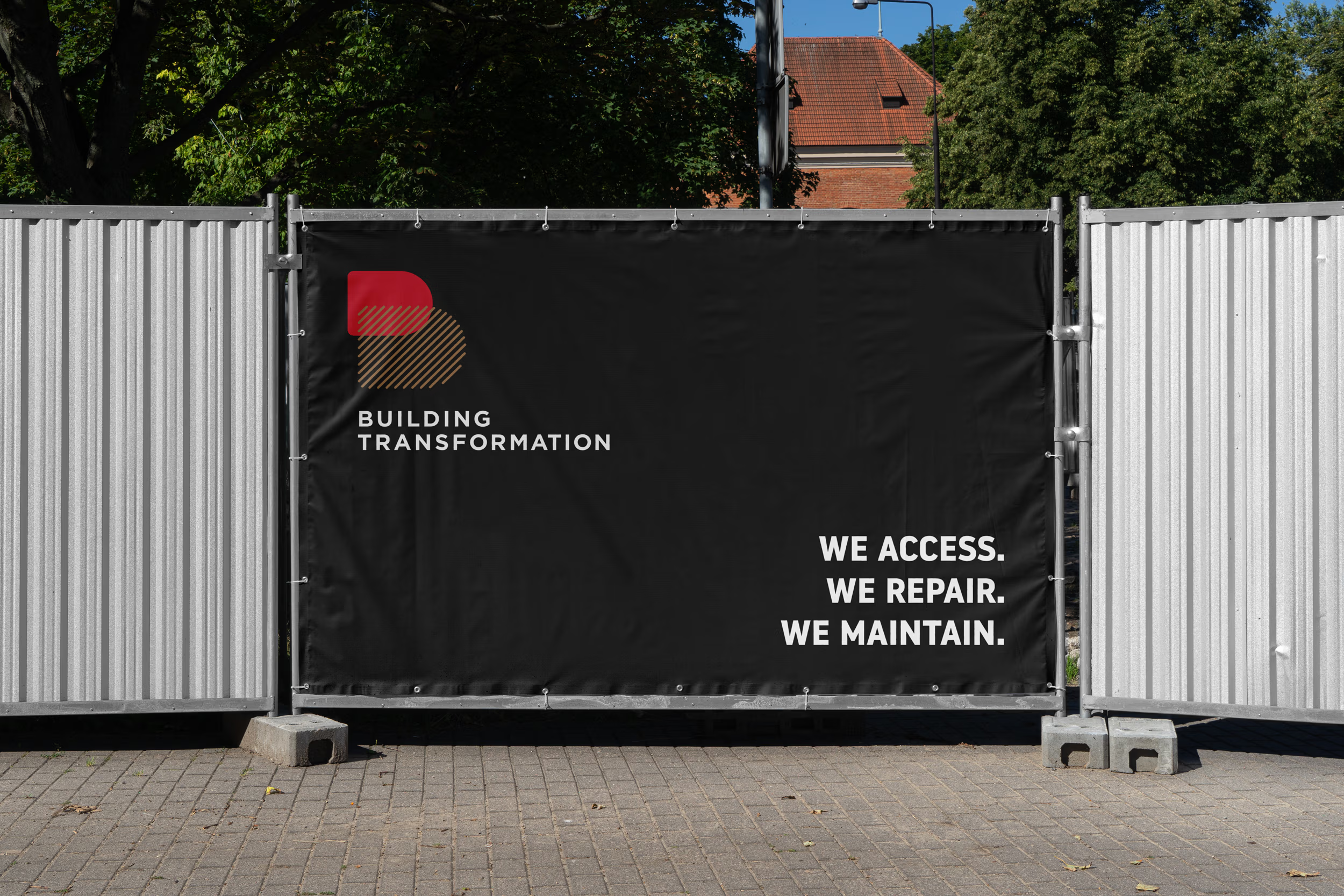
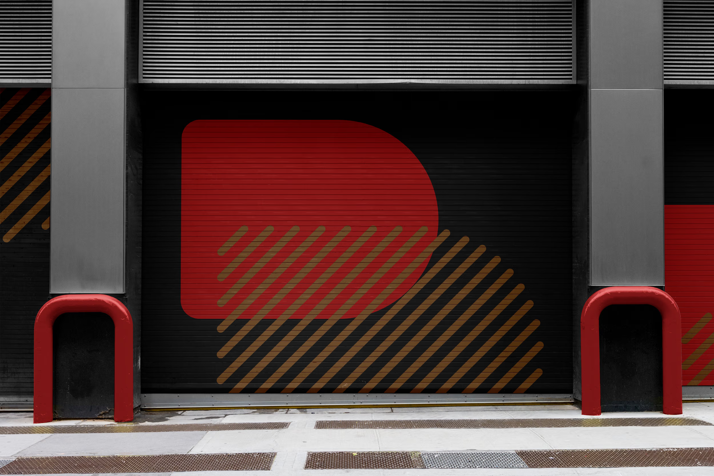
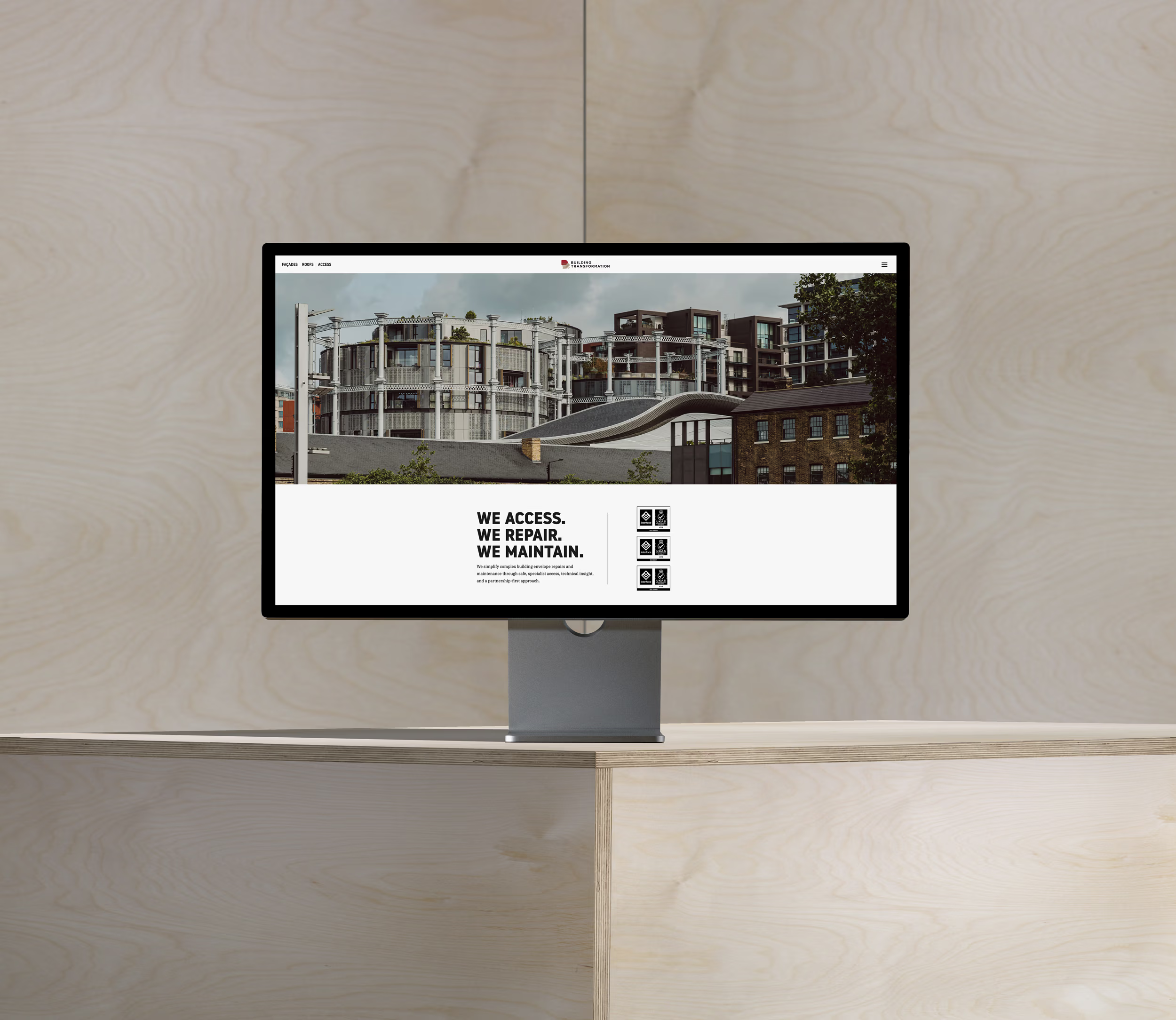
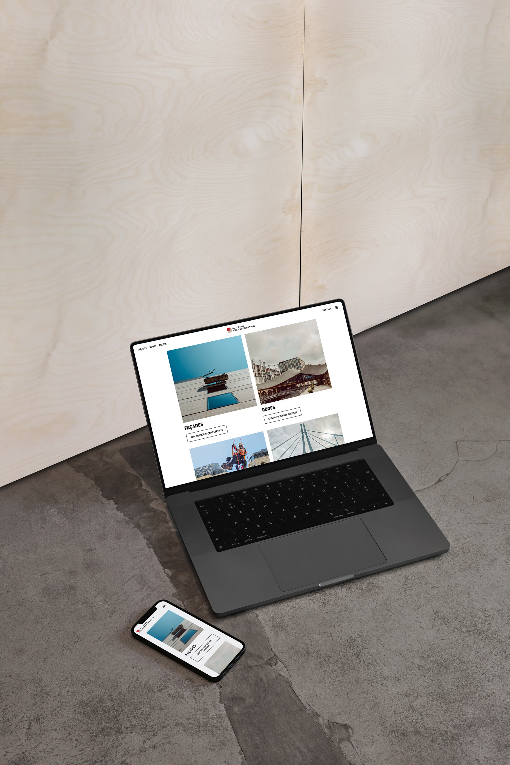
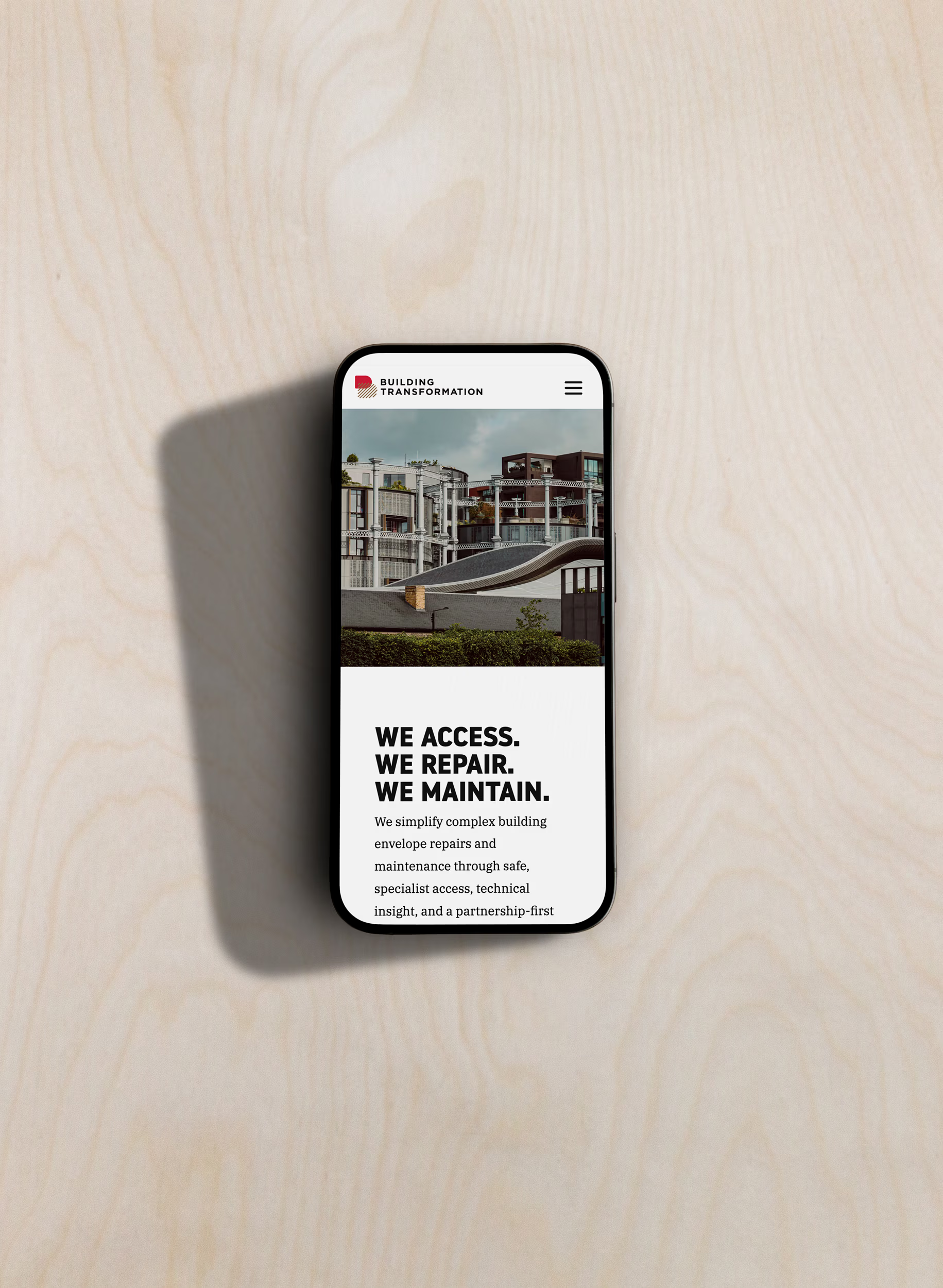
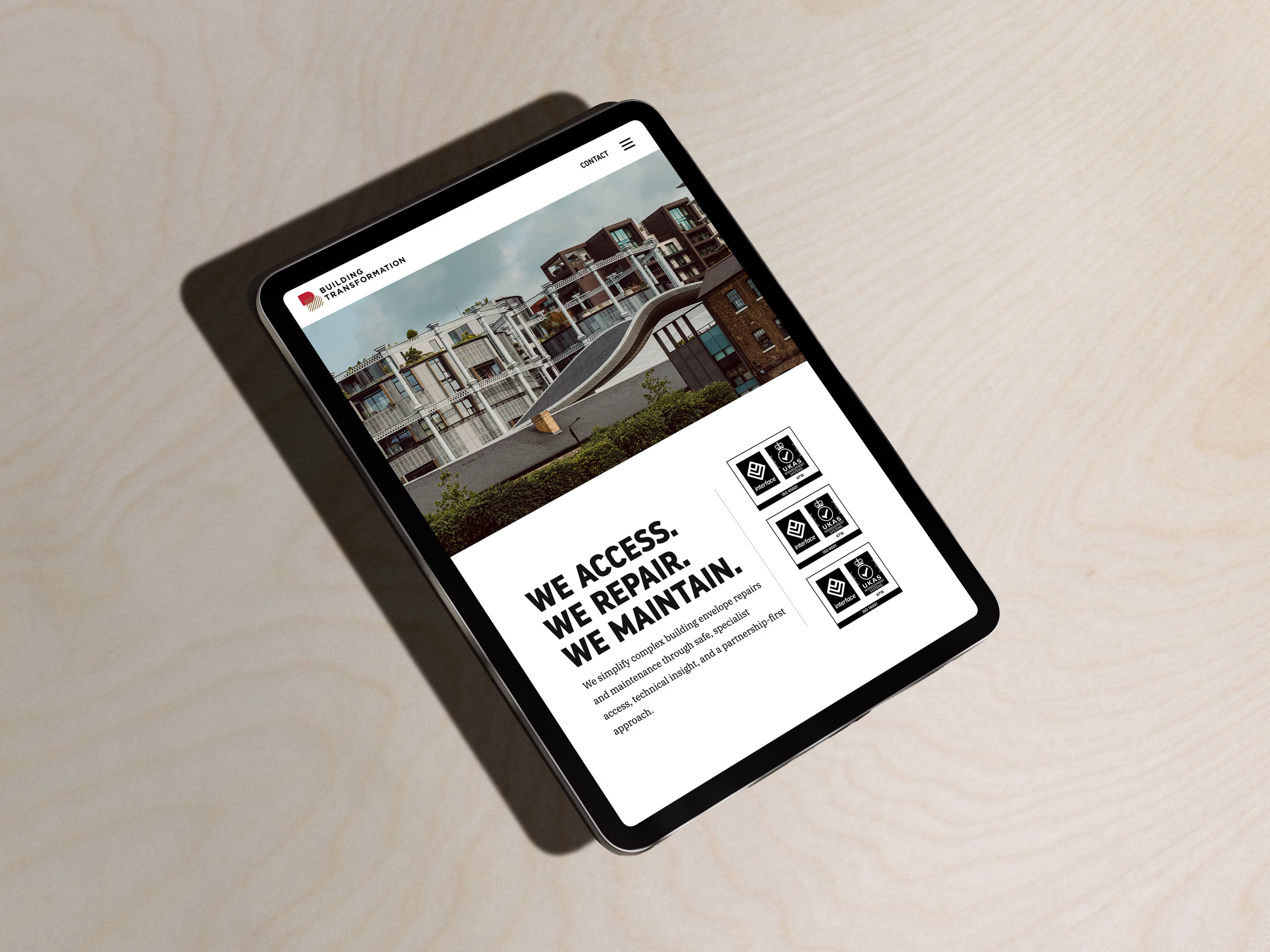
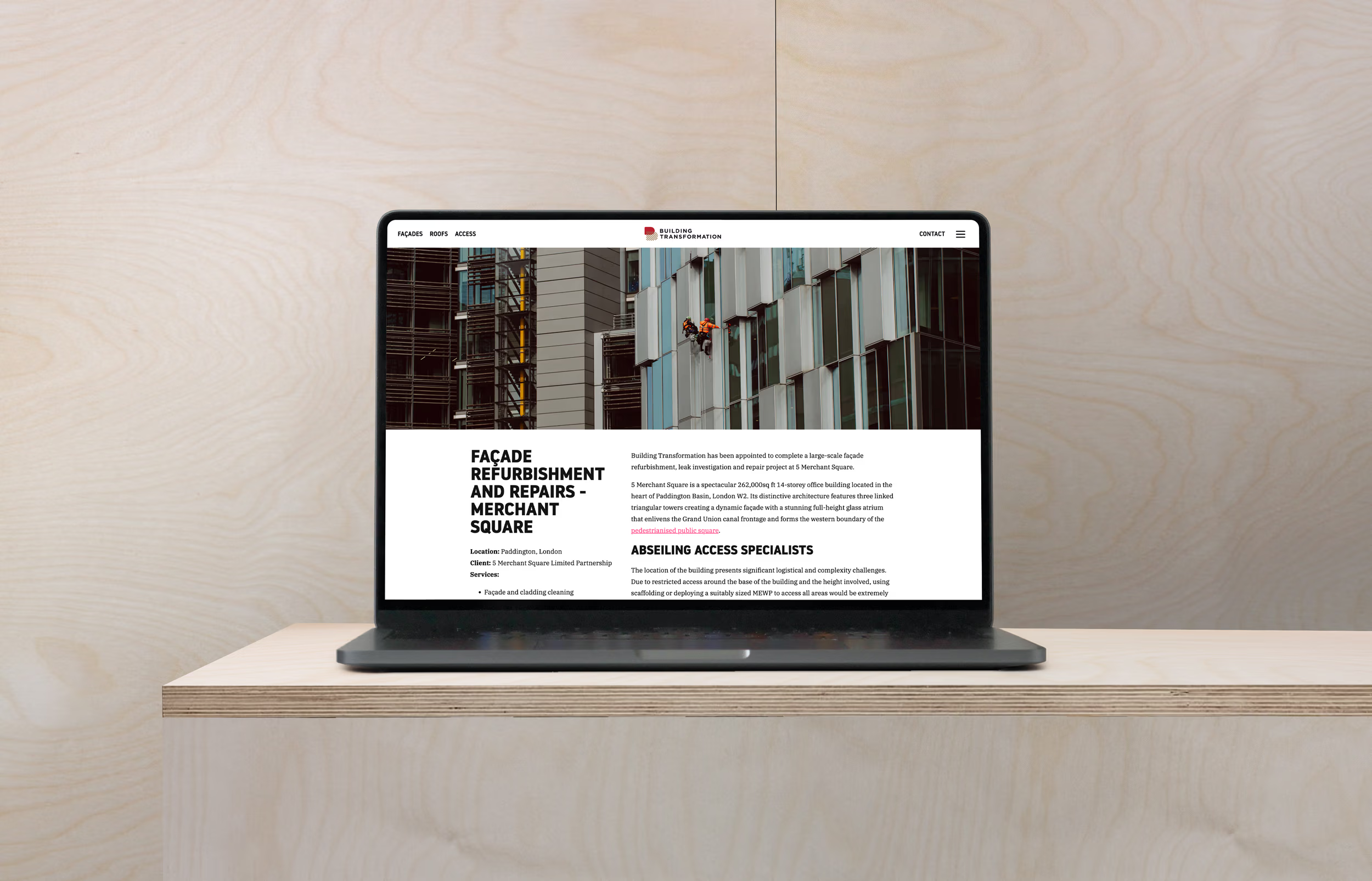
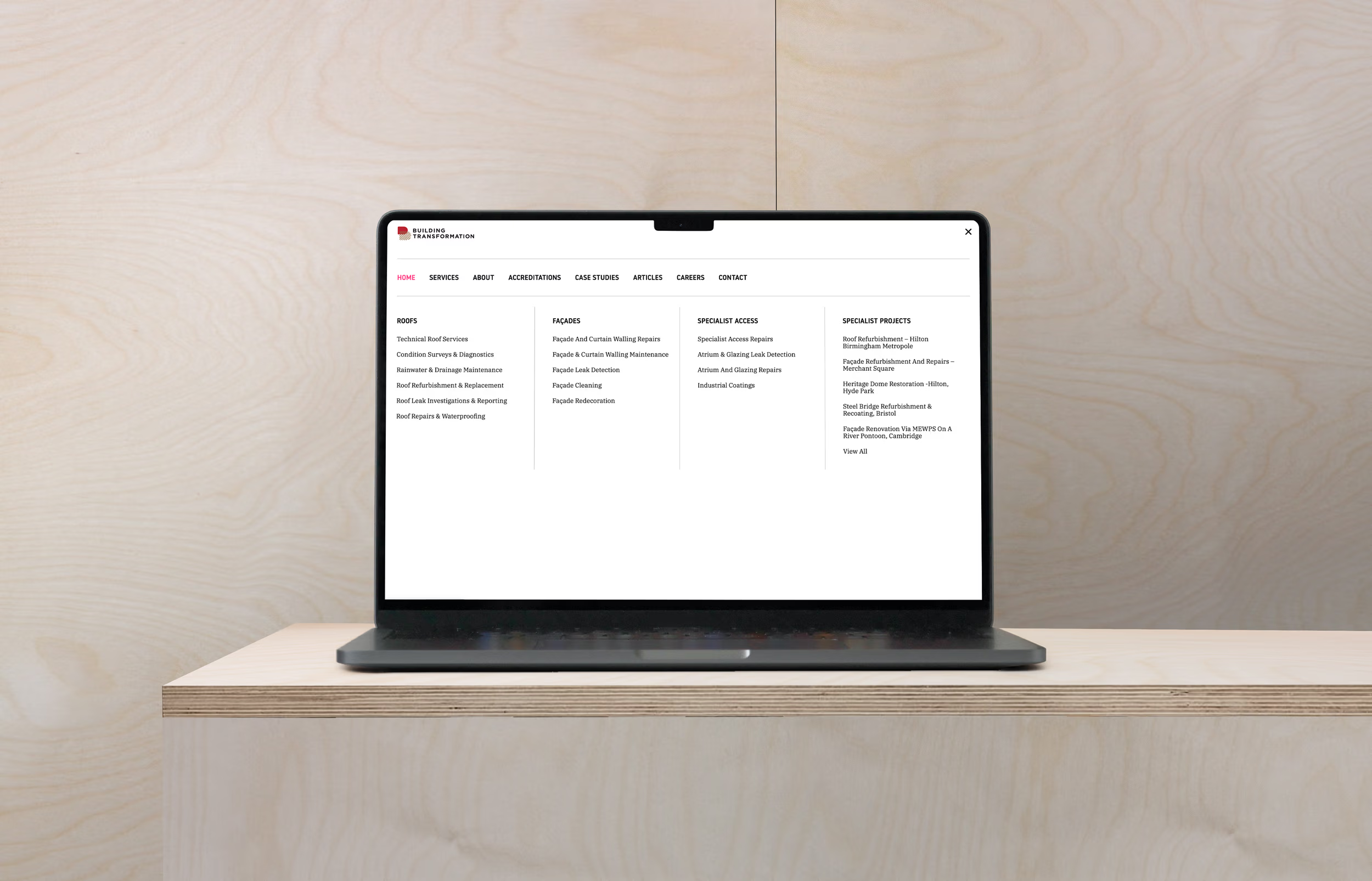
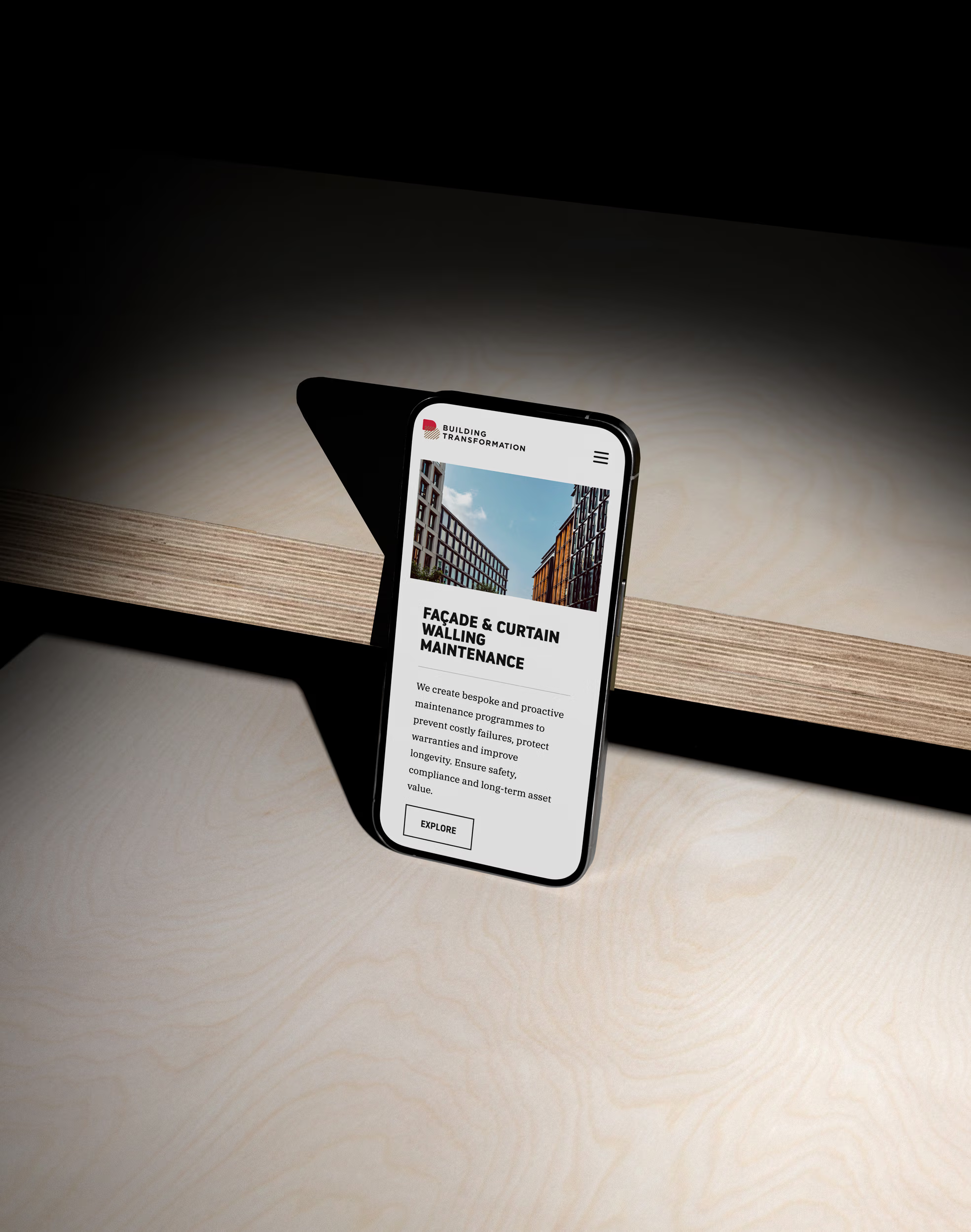
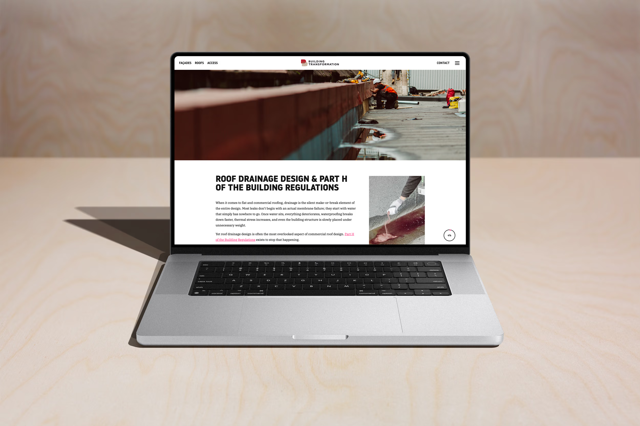
First we refreshed the brand identity by creating a flexible and scalable logo system. They previously had only 1 version of their logo, which did not scale at all and was not suitable for modern touchpoints. We also created a secondary colour palette for their roofing arm of the business.
In addition as part of the process a clear brand message was formed
WE ACCESS.
WE REPAIR.
WE MAINTAIN.
Clear and straight-to-the-point, echoing the core offering of the business confidently.
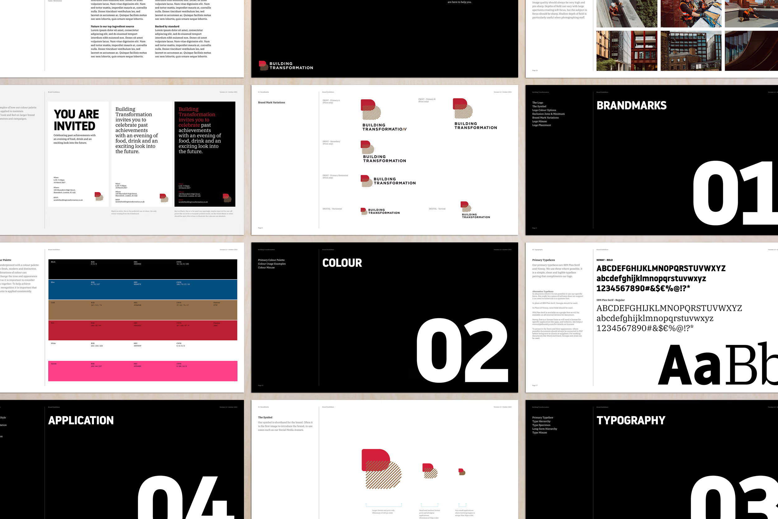
We produced a comprehensive set of brand guidelines, helping their in-house team stay on brand, although Milk Bottle continue to support branded content and touchpoint design on an ongoing basis.